Managing Classes Made Intuitive
overview.
425 Fitness is the gym that I use
They offer a wide range of services from a full floor of gym equipment, to a spa, and classes. Their app is where members get updates, view class schedules, and plan their workouts. Sounds ideal right?
However, the classes were underused. The scheduling section within the app felt incomplete and broken, and quite frankly, got in the way.
My Contributions
Research
Competitors and Interviewed current members.
Redesigned Experience
By auditing the current design and analyzing data to create a new flow.
Tested and Re-tested
To find out what fell through the gaps within the new design.
audit.
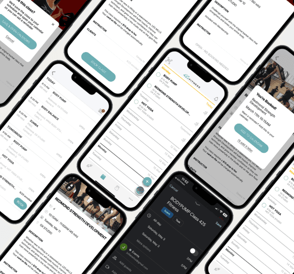
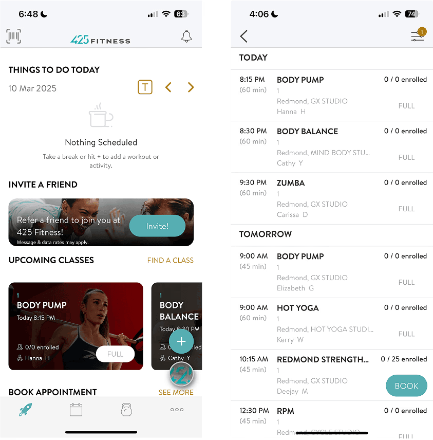
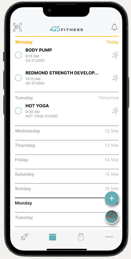
The class schedule at first glance looks pretty straight forward. They display upcoming classes, leading to a time sheet with more info. Pretty typical right?
When you look at the fine print though, it becomes much more confusing. The open classes are labeled FULL and it that it's 0/0 Enrolled. There's one class that says BOOK, yet it's a non-functional button. Users are instead directed to go to the front desk. On top of that, it's actually a PAID class and you don't find out until you reach the front desk.
Having this many errors leads to frustrations and distrust, and that was what I was here to solve.
425 FITNESS APP ORIGINAL EXAMPLES

research.
I ran a high-level competitor analysis of similar fitness apps, including 24GO, Orangetheory, and Seattle Athletic Club.
They all offered clear class labels.
Two allowed for a calendar sync or add-to-calendar.
425 Fitness felt like it had fallen behind in user experience standards.
I interviewed 5 active members of 425 Fitness who attended classes. I focused on their current habits, what features they used (or didn't), and what was getting in the way of keeping a consistent routine.
The Verdict
The business goal was to increase class participants.
HOW MIGHT WE...
Streamline the class scheduling experience so that members stayed on their fitness plan?
HOW MIGHT WE...
Clarify information with minimal tweaks to gain more trust and participation?
Participants were already using their calendar to add their classes.
Since it was manually inputted, sometimes there were errors. Based on this in combination with users' notification comfort, there was a great opportunity for an add-to-calendar or calendar sync feature to solve this problem.
Here were the features we went with:
Integrating Concepts into an Established System
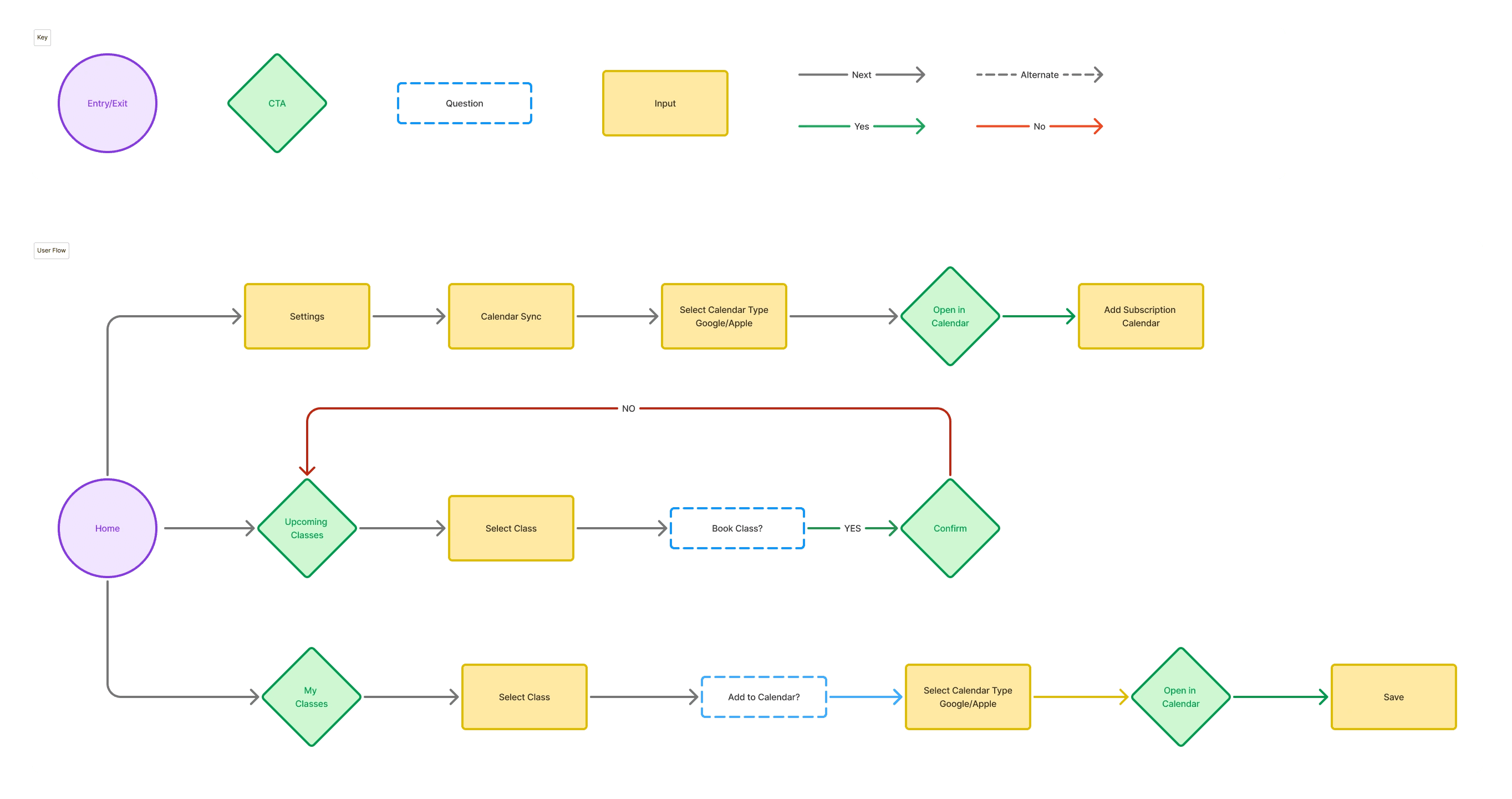
USER FLOWS
Wireframing
LO-FI SKETCHES


I needed to see if this was the right direction.
So I tested the lo-fi mockup sketch with 5 people.
In my original design, I included a calendar sync, but user feedback showed me it was better to scale it back. Users enjoyed the idea of being able to sync classes, but voiced that it felt complicated—and we want to make things easier, not harder.
Further, there was confusion about which classes were paid, especially if all of them required booking. Another indicator to simplify things, and focus on clarity.
With that feedback, the priority shifted.
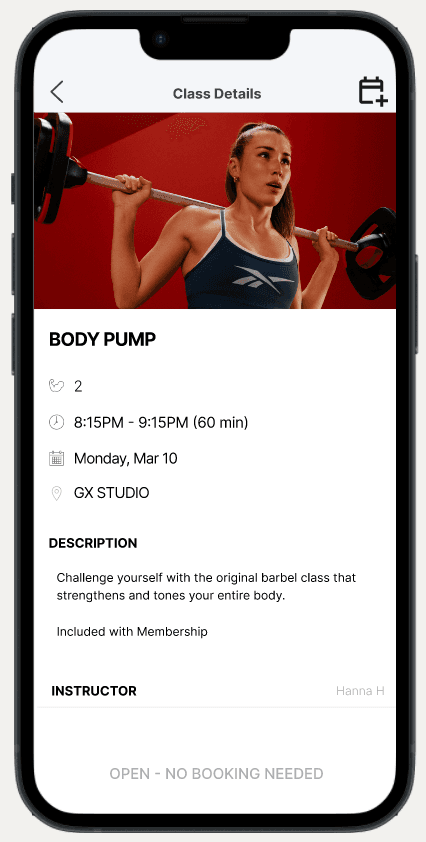
HI-FI MOCKUP


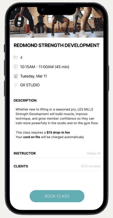


I needed a final sanity check so I could make the necessary tweaks before hand-off
I ran a final usability test with five participants, and it showed that there were still small opportunities for clarity
Thankfully, these findings all had very simple fixes that would have a high impact on the user experience.
✔️
✔️


✔️
✔️


✔️

prototype.
Lessons in Clarity and Restraint
This project challenged me to improve a real app without overcomplicating the solution. I started with a big feature set, but early testing made it clear: users didn’t want full calendar sync — they just wanted a simple way to save classes they cared about. Scaling back helped me focus on what mattered most.
I also became a sharper observer. Some users read everything. Others clicked through without hesitation. Designing for both taught me that clarity isn’t optional — it’s essential.
Moving Forward
If I had more time, I’d continue refining the schedule view and experiment with lightweight ways to manage saved classes. But this project reminded me: simplicity isn’t about doing less — it’s about doing exactly what the user needs.